December 20, 2021
Published by Lakfoil Web Admin on December 20, 2021
Categories
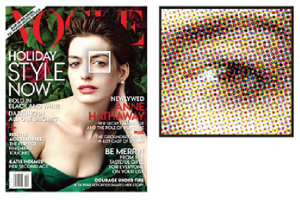
Offset lithography is a process that uses a combination of four process colours, cyan, magenta, yellow, and black, generally noted as CMYK, to produce full-colour images.
Do you like it?
December 19, 2021
Published by Lakfoil Web Admin on December 19, 2021
Categories
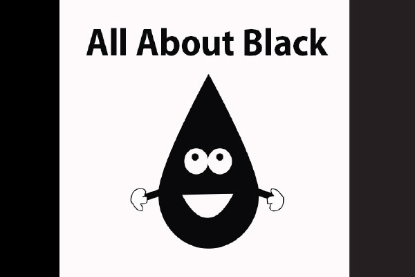
As previously mentioned, both Illustrator and InDesign default to plain black, where it’s more often recommended you do your type setting for documents anyway. If, however, something happens where you’ve accidentally set especially large amounts of type in any variant of rich black, you might notice a problem in your final printed piece. If your press operator runs your job and doesn’t perfectly match up each separation of CMYK by precisely lining up the document’s registration marks, or if the paper shifts at all while moving through the rollers on press, you’ll likely see ghosting of one or all of C, M, or Y falling outside of the characters in your type, making it not nearly as sharp as expected. Your printer might end up doing it well regardless, but it also might take them more time, paper, and energy to print it correctly.
Do you like it?
December 18, 2021
Published by Lakfoil Web Admin on December 18, 2021
Categories
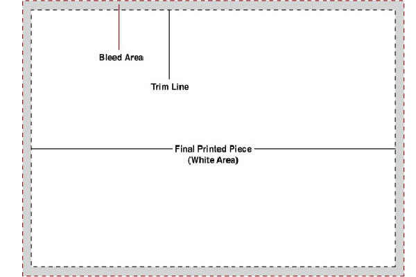
If you’d like any/all of your image(s) to run completely to the edges of your final printed piece, you’ll have to include what’s referred to as bleed on all edges of your documents.
Do you like it?
December 17, 2021
Published by Lakfoil Web Admin on December 17, 2021
Categories
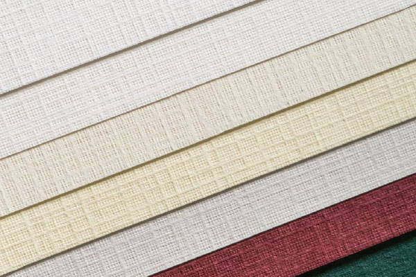
What is paper grain? Being knowledgeable about paper grain and ways you can ensure your documents are “going with the flow” will pay off in document […]
Do you like it?
December 16, 2021
Published by Lakfoil Web Admin on December 16, 2021
Categories
Don’t Bold or Italicize Fonts From the Style Menu In any standard layout program, there’s a font bar where all of the options for choosing a […]
Do you like it?
December 14, 2021
Published by Lakfoil Web Admin on December 14, 2021
Categories
When you’ve finished creating your design, you’ll want to do a couple things with your fonts in order to send them you your printer correctly. Packaging […]
Do you like it?
December 13, 2021
Published by Lakfoil Web Admin on December 13, 2021
Categories
Although these might be the basics, they’re also the problems that prepress operators most often face when preparing files for printing. The best way to avoid […]
Do you like it?
December 12, 2021
Published by Lakfoil Web Admin on December 12, 2021
Categories
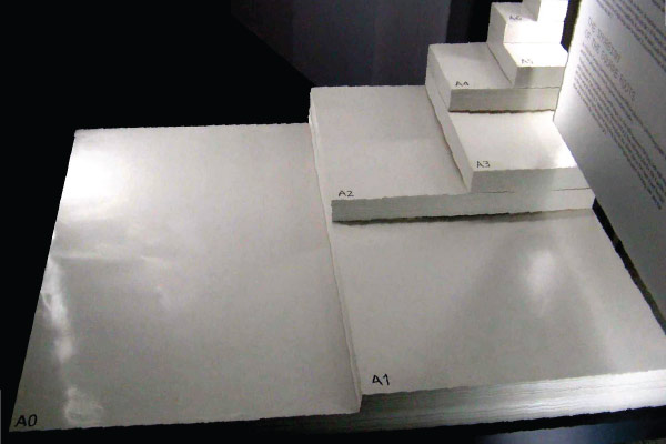
ISO paper sizes Japanese B-series paper sizes
Do you like it?

